Pearl River County SPCA
A complete rebrand and website redesign for an animal shelter, enhancing their presence and impact in the community.
Overview
Challenge
The Pearl River County SPCA needed a complete rebrand to modernize their image and increase community engagement. Their existing branding and website were outdated, making it difficult to effectively showcase adoptable pets and communicate their mission.
Approach
We conducted extensive research into animal shelter branding and user experience, focusing on creating a warm, approachable identity that would resonate with pet lovers while maintaining a professional appearance. Our approach prioritized ease of use for potential adopters and donors.
Solution
We developed a comprehensive brand identity system including a new logo, color palette, typography, and visual language. The new website features an API integration for pet profiles, making it easier for visitors to browse adoptable pets and streamlining the adoption process.
Key Results
0%
increase in adoption rates
0K
pageviews/month
0%
increased Facebook interactions
Bourbon & Branch had the privilege of leading a complete rebrand for the Pearl River County SPCA to elevate their presence and enhance their impact in the community. This rebranding included the creation of a new, modern logo and a comprehensive branding package.
The fresh visual identity is designed to convey trust, compassion, and the evolving position within PRCSPCA's mission.
The branding package features a cohesive color scheme of navy blue, green, and orange, as well as the friendly and timeless Futura typeface.
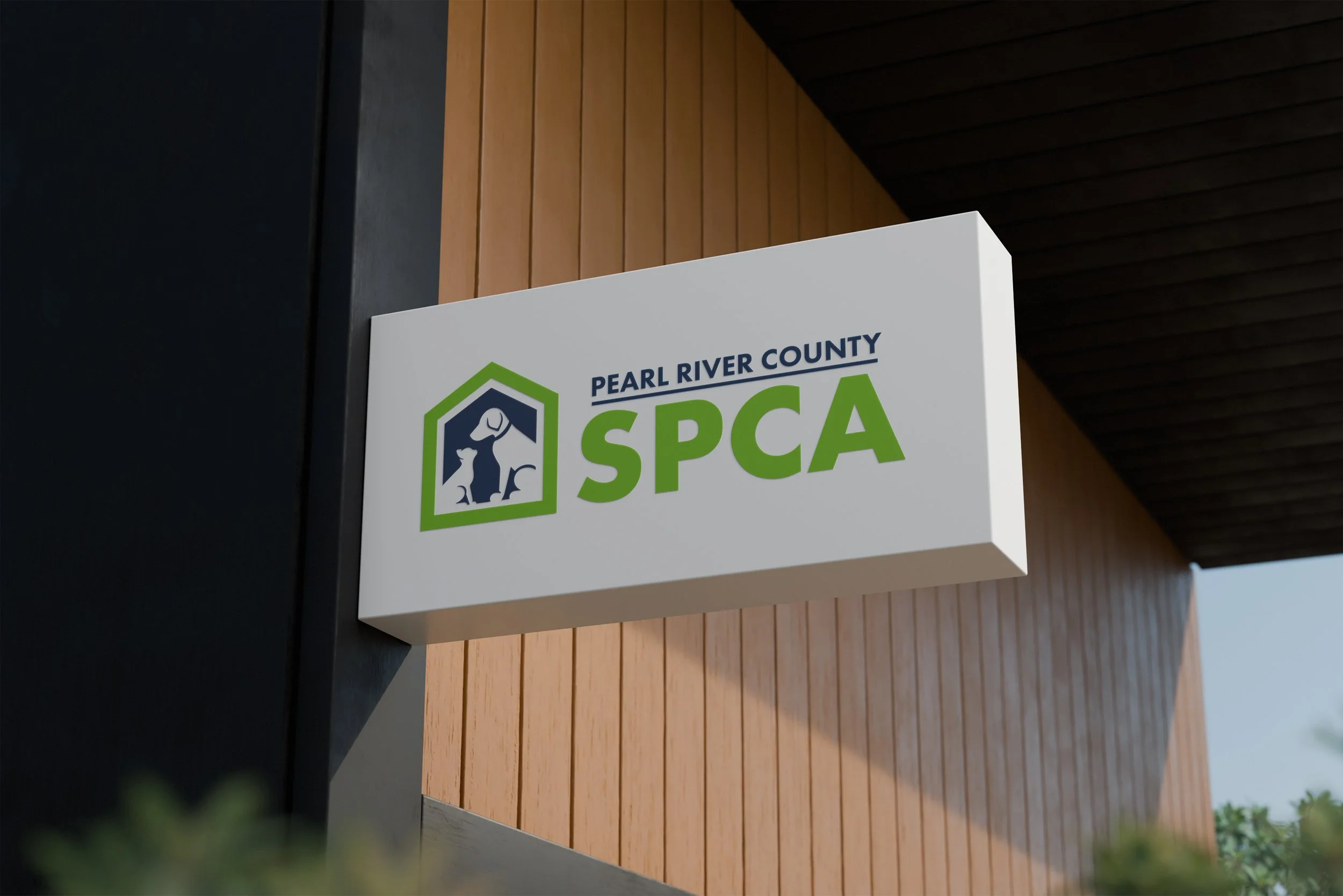
The new Pearl River County SPCA logo design mockup showcasing the modern, compassionate visual identity.
Social Media Strategy
Additionally, we built their social media strategy, creating engaging and informative content that highlights their mission, showcases adoptable pets, and encourages community involvement.
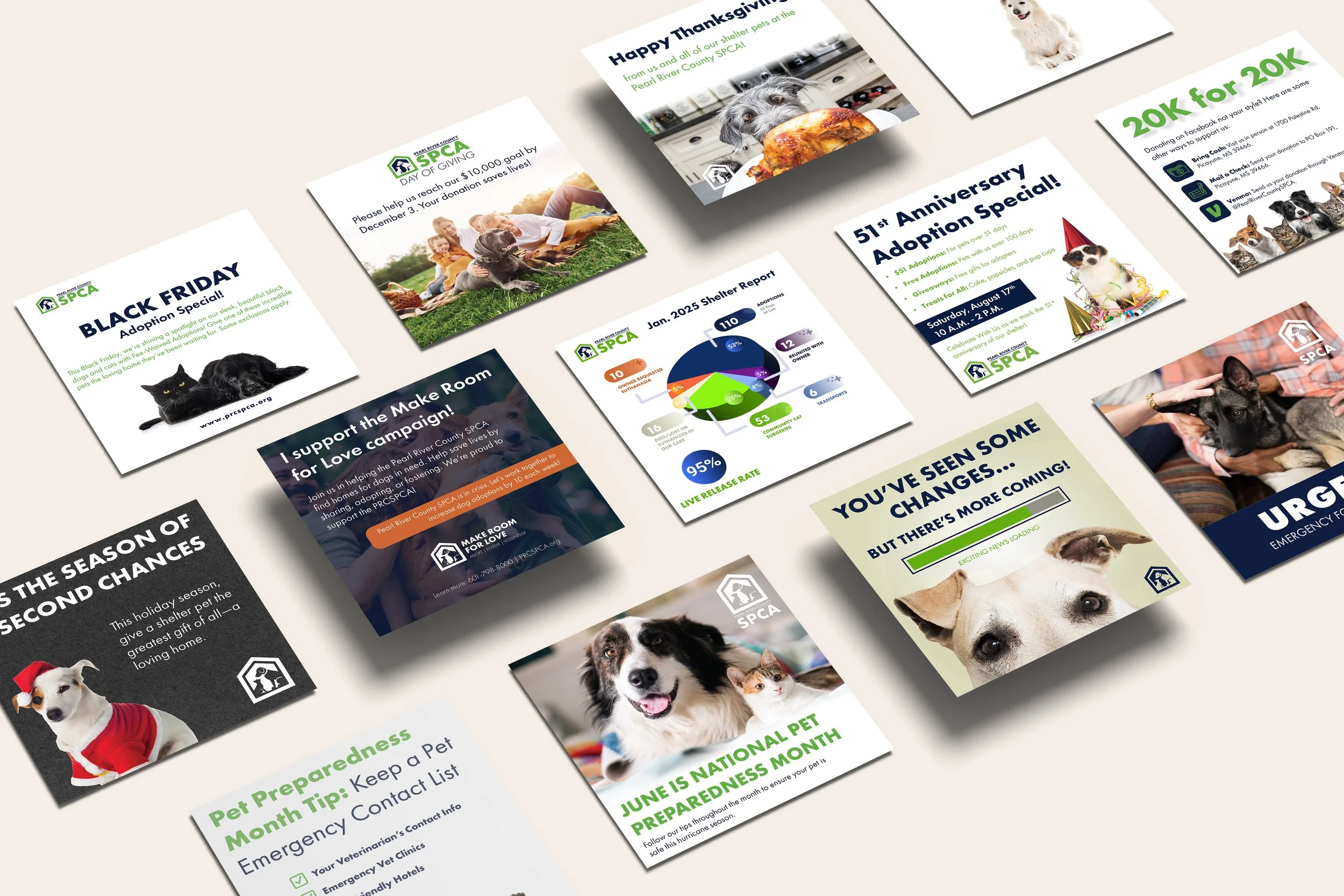
Social media graphics showcasing consistent branding across various platforms and content types.
Website Development
As part of this transformation, we designed and launched their new website to provide a user-friendly, visually appealing, and informative platform. The website features essential functionalities such as easy navigation, a dedicated section for adoptable pets, information on how to donate and volunteer, and resources for pet owners.
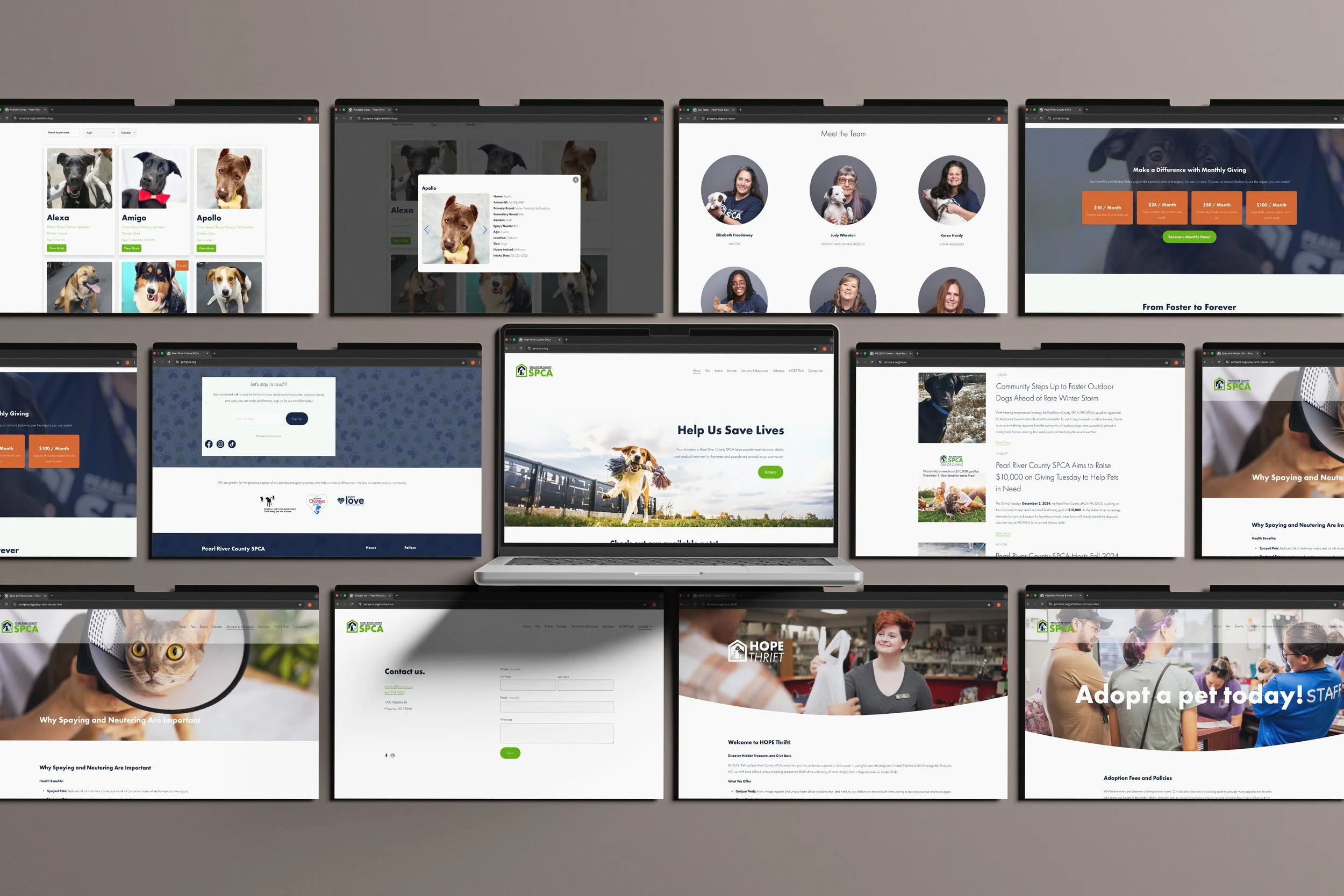
Website design mockups showing the responsive layout and user-friendly interface across different devices.
A key component of this website is the API integration designed for the pet profiles, ensuring that website visitors can easily browse available pets, view their photos and details, and streamline the adoption process, making it easier for potential adopters to find available pets. The new online presence not only boosts the SPCA's visibility, but also improves efficiency, making it simpler for the community to engage with and support their mission.

API integration showing dynamic pet profile cards with real-time adoption information.
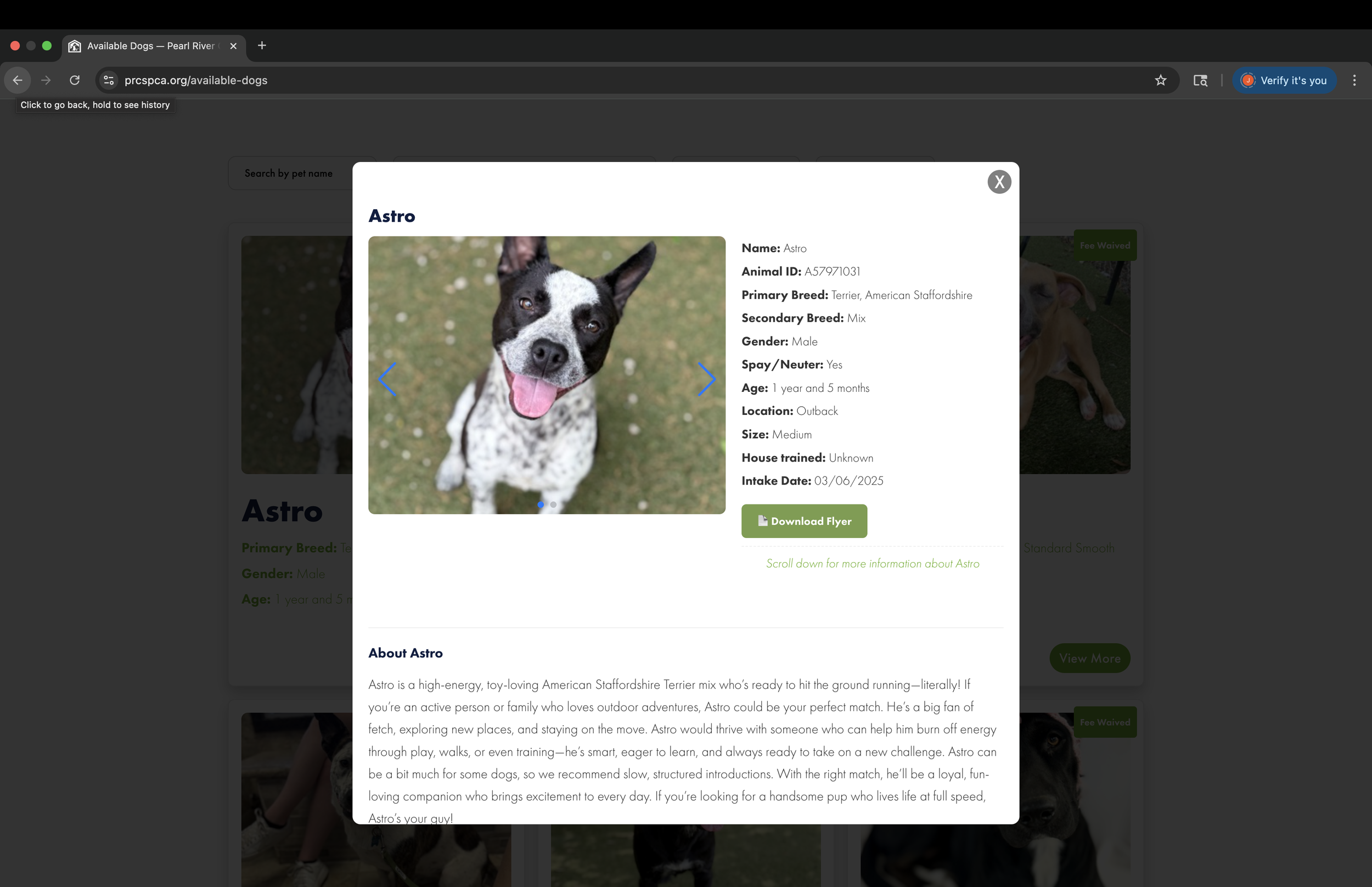
Interactive popup design for enhanced user engagement and call-to-action functionality.
Through these efforts, we have created a strong and consistent brand that reflects the organization's dedication to animal welfare and resonates with their supporters.
Logo Redesign
The Challenge
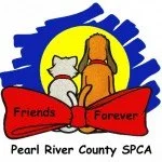
The original logo of the Pearl River County SPCA featured a dog and cat looking away into a sun with a red bowtie and Comic Sans as the typeface. While well-intentioned, this design was overly busy and functioned more as a graphic element than an effective branding tool.
The Problem
The use of Comic Sans, in particular, projected a lack of professional and cohesive brand identity. The use of Comic Sans, in particular, did not align with the seriousness and compassion inherent in the SPCA's mission. Furthermore, the elements in the logo did not communicate a clear message of protection and care, which is central to the organization's goals.
The Solution
In contrast, the new logo design presents a simplified and modern aesthetic with a dog and cat silhouette enclosed in a house shape. This clean, concise imagery effectively symbolizes the shelter and protection that the SPCA provides, creating a stronger visual impact and a more memorable brand identity. The updated design elements, including the house motif and simplified animal silhouettes, communicate a clearer and more professional image, better reflecting the organization's values and mission.
Logo Transformation
Before
After

See the full website here:
Ready to transform your brand?
Let's discuss how we can help your organization achieve similar results.